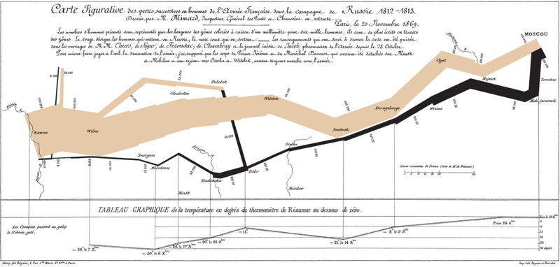
Humans respond very well to pictures. We just have a natural ability to distinguish and extract meaning from patterns in visual data. Relationships within large or complex data sets have long been communicated visually through the use of 'infographics' in newspapers and in books.
Static infographics: Napoleon's March to Moscow
The advent of television and film introduced a temporal dimension to these visualisations. Process flow and Time Series data ( the set of values of a property recorded over a period of time) are both particularly well suited to visualisation through animation.
Animated infographics: Areva
The most recent step has been to take those animations and make them interactive. This turns a teaching tool into an exploratory one and the benefits of this were famously demonstrated by Hans Rosling in his GapMinder presentation at TED 2006.
Interactive infographics: Hans Rosling demos GapMinder at TED 2006